Microsoft Updates Company Logo

Rob Williams

Editor-in-Chief
Staff member
Moderator
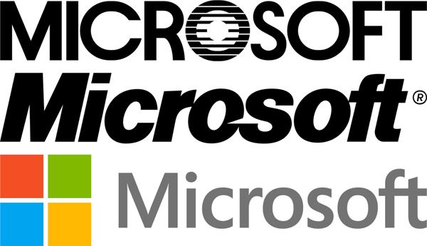
Microsoft has had the same logo for the past 25 years, so with such an ambitious Windows 8 launch ahead of it, wouldn't it be a good idea to modernize it a little bit? Well, the company thought so, as it today rolled out a brand-new logo that looks nothing at all like the logo of old. Given Microsoft's logo updates in recent years for its other products, this new main logo shouldn't come as much of a surprise. It's clean, modern and crazy easy to create an SVG lossless of (if it wasn't already supplied) due to its simplicity.

microsoft_logos_since_inception_082312.png

Read the rest of our post and then discuss it here!
 

madmat

Soup Nazi
I think it looks too simple. It reflects perfectly the dumbing down of our culture.

The "Don't make me think" generation is making me ill.
 

Rob Williams

Editor-in-Chief
Staff member
Moderator
A couple more ancient logos are revealed here:

http://techland.time.com/2012/08/23/a-few-thoughts-on-microsoft-logos-new-and-old/

I thought there was just three, but no. The earliest two were barely seen though. Of all of them I think the last one was my favorite, in terms of design. The chip out of the letter never made sense to me but I still prefer it over all the others (though the one from the 80s is appropriate for the era I'd say).
 
Top