Valve Takes Steam's UI Update Out of Beta

Rob Williams

Editor-in-Chief
Staff member
Moderator
It's been just a little bit over two months since Valve unveiled its UI overall for Steam, but up to this point it has been classified as a beta (and required user intervention to access). The company has now deemed the update as stable, though, so now every copy of Steam should reflect the revamped UI on the next start-up. Love it or hate it, it's here to stay.
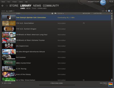
steam_ui_update_042710_thumb.jpg


You can read the rest of our post here.
 

Kougar

Techgage Staff
Staff member
The library thing is actually fairly decent, it just took me a bit to realize you can use it several different ways. After clicking the Library name the user can click one of four subheadings under it to change if they want to view games, media, tools, etc... But also, they can select from three types of views just for their games alone. In your screenshot you're using the List view, but I find the Details view to be my favorite. It has links to anything and everything you'd want right there... news links to read the latest patch updates or changelogs, links to the steam gameforum, and all your friends that are currently playing that specific game or own it.

The new UI had some serious bugs, but now that they've sorted those out I'm a big fan of the new interface. They took some cues from Windows 7 in how easy it is to navigate around to what you are looking for in just one or two clicks.
 
Top