Revamped Ribbon-based File Manager Coming to Windows 8

Rob Williams

Editor-in-Chief
Staff member
Moderator
Microsoft has been divulging quite a bit of information on its upcoming Windows 8 OS on its official development blog, and the juicy tidbits don't seem to have an end in sight. In a new update, the company has gone into great detail about the improvements that the Explorer file manager will be seeing, which not too surprisingly, will introduce a ribbon bar - a la Office

windows_8_file_manager_083011.jpg

Read the rest of our post and then discuss it here!
 

marfig

No ROM battery
The thing I liked most was the merging of multiple copy and move operation into a single dialog. With the added benefit that clicking the details button lets us see a graphical representation of data transfer rates for each operation. We can then pause and resume operations based on more informed decisions.

Granted it's not something I see myself using much. Performing multiple copy/move operations is not a part of my explorer usage pattern. But it's good to be there in case it's needed.

The ribbon annoys me slightly. I'm not a fan of that UI choice since it first came out. I prefer the menu grouping based on File/Edit/Help/etc operations instead, that was historically a big contributor to a higher than average items location consistency between different applications. The ribbon has failed considerably in promoting the same locations for the same commands. The ribbon panels aren't even named the same between applications because often developers feel legitimately compelled to name them based not on the "old" universal categorization (there's not one anymore under the ribbon control -- and that's the problem), but on whatever operation grouping makes sense for that particular program.
 
Last edited:

DarkStarr

Tech Monkey
Oh god no. That just looks fugly. Their better be a way to change back or I will be keeping windows 7. Its just so cluttered, it doesn't even look like a file explorer app. It looks like some horrible word/excel file manager mixup.
 

marfig

No ROM battery
Oh yeah, absolutely. Screen real estate suffers from the ribbon too. It's even somewhat ironic that it's exactly vertical space that we lack the most on mainstream monitors, but that's exactly what every new UI design seems to want to use.
 

MacMan

Partition Master
When it comes to this, well... .I absolutely love it, only I kind of hate it, if that makes any sense?
 

marfig

No ROM battery
I think it does. It's a provocation :rolleyes:

Most Windows users can take it though. We aren't exactly fans of many UI choices. But neither we are of MacOs'. :D
 

Rob Williams

Editor-in-Chief
Staff member
Moderator
marfig said:
The ribbon annoys me slightly. I'm not a fan of that UI choice since it first came out. I prefer the menu grouping based on File/Edit/Help/etc operations instead, that was historically a big contributor to a higher than average items location consistency between different applications.

I might be an odd user, but even with this ribbon I don't think I'd ever use it. In the current version of the file manager, I right-click to do anything, from deleting to renaming. For things like cut, copy and paste, I just use the keyboard shortcuts, since my fingers are usually right position for that at all times.

What I find humrous is there that's actually an "Open" button. So rather than people double-clicking their file to open it, they move their mouse inconveniently to a small button that says Open. *slaps head*
 

Tharic-Nar

Senior Editor
Staff member
Moderator
Remember, Windows 8 is for tablets too... so the ribbon makes sense for the venerable sausage-fest that'll be playing around with the screen... double tapping... touch interface...

Too crude? :p

I'm kind of glad about some of the changes, but without actually using it, I can't pass judgment. There are lots of little things that got changed with Explorer going from XP to Vista to 7, most of the changes were not positive. Like the removal of the status bar showing you the current directory size... i mean, really? How about expanding a folder in the tree view only to have the folder scroll to the bottom of the list, forcing you to scroll down just to look at the contained folders (in the tree view). Then there was the removal of the 'up' button too, which i did actually find useful.

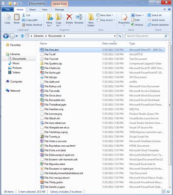
At least it looks like the status bar is making a comeback, instead of that completely useless 'details' bar - that bar was huge and spent more time showing you nothing than anything useful, complete waste of space. Other notable details includes the comeback of some of the 'power tools' released under XP, like 'open command prompt here...'. Basically, it looks like windows XP file manager with library functions and a ribbon interface.

Speaking of libraries; if they don't add network support - complete fail. The removal of the favorites menu was silly too, save a bookmark to a common folder, that was great in XP. But no, Vista and 7 wanted people to use libraries, great, but if the directory is on a network, it's a no go. Yes, I pay too much attention to the little things...

Worth mentioning though that it should be possible to disable the ribbon, since the GUI is very customizable. Microsoft should at least give the option to allow users access to a standard menu with context support and ditch the ribbon entirely. You can enable the standard menu under 7, so it shouldn't be a stretch for 8... but we know how MS can be.
 
Last edited:
Top